
Connecting the Dots: What Layering Different Data Sources Reveals about RSV
By overlaying hospital, wastewater, and search data, PopHIVE reveals how respiratory viruses move through different age groups and communities.

Tracking Viruses through Data
What if you could watch a virus move through a community from every angle—how many people are testing positive at a doctor or hospital, how much virus is present in sewage (wastewater), even Google searches for information on the virus?
Each of these data sources captures a different moment in time. Alone, they tell part of the story. Together, they reveal how infections really spread, who gets hit first, and when communities start to feel the impact. That’s exactly what we’ve done at PopHIVE.org.
RSV Data Reveals a Hidden Story
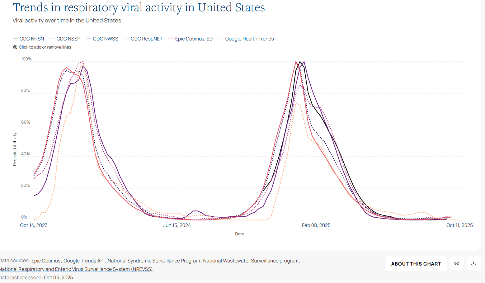
Let’s take a look at one respiratory disease in particular: RSV (or respiratory syncytial virus). RSV is a virus that causes serious illness (many cases leading to hospitalization) in babies and older adults.
On PopHIVE, we have brought together several different data sources on respiratory syncytial virus (RSV) and overlaid them to see how the dynamics compare.
For clinical activity, we have data for hospitalizations and emergency departments from CDC NHSN (hospitalizations), NSSP (emergency department), RespNET (hospitalizations) data and the Epic Cosmos (emergency department) data.
For measuring how many people could be infected in a community (or community level transmission), we use CDC NWSS wastewater (sewage) data to capture viral concentrations in wastewater.
For people searching for things related to RSV, we use Google Health Trends.
Take a look at the trend chart below 👇 - do you see any patterns? Even though they come from very different systems, all of these datasets reveal the same broad seasonal pattern — RSV rises and falls at roughly the same time each year. But when you look closer, some signals start to rise earlier than others.
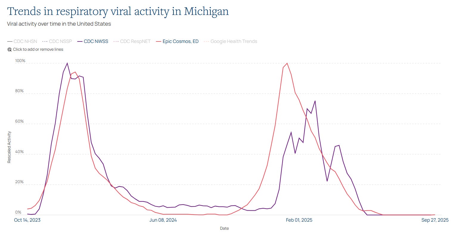
When Data Conflicts With What We Thought
Zooming in on Michigan, we compared wastewater data and emergency department (ED) visits from Epic Cosmos.
Conventional wisdom says wastewater data often gives an early warning of an outbreak. But here’s the surprise: in many states — including Michigan — emergency department visits increased before the wastewater signal did.
The Story Behind the Trend
At first, this was puzzling. Until we looked at who was getting sick.
Breaking down the emergency department data by age (see the example from New York below) revealed the key:
Young children were getting infected first (mostly who are in diapers, not contributing to sewage/wastewater data).
Older adults followed several weeks later.
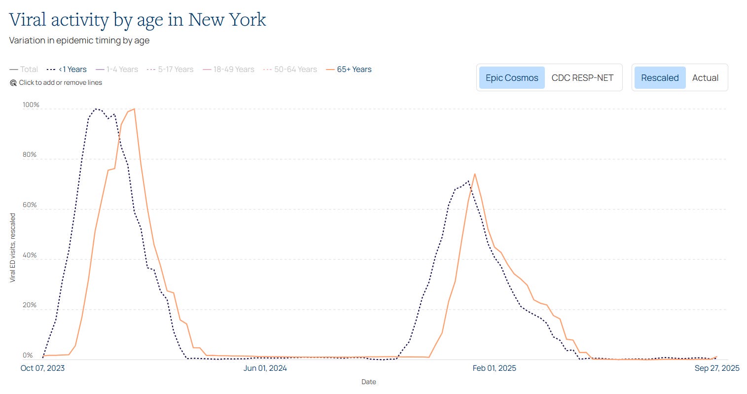
That timing explains that the clinical activity is largely driven by the early increase in cases in young children, while the wastewater signal (and Google search) signal is being driven by what is happening in the adult population.
Explore the Data Yourself
This is just one example of the kinds of insights you can uncover with PopHIVE.
You can explore these same patterns — and others — on pophive.org.
Play with the data. Compare signals. See how influenza, COVID-19, RSV, and pneumococcal disease change over time and across states.
Because when we look at the same virus from multiple perspectives, we get closer to understanding what’s really happening in our communities — and how we can respond faster, smarter, and together.